Refreshing a Fractional CPO’s Visual Identity
The Challenge ↓
Hyrum Palmero is a senior product designer and startup consultant. He helps early-stage teams build better MVPs through strategy, clarity, and user-focused design.
His work was strong, but his visual identity didn’t reflect that. The challenge was to redesign his logo and brand system to match his personality: minimal and confident, and give him a solid visual foundation for everything he’s building.
A Distinctive Brand Mark
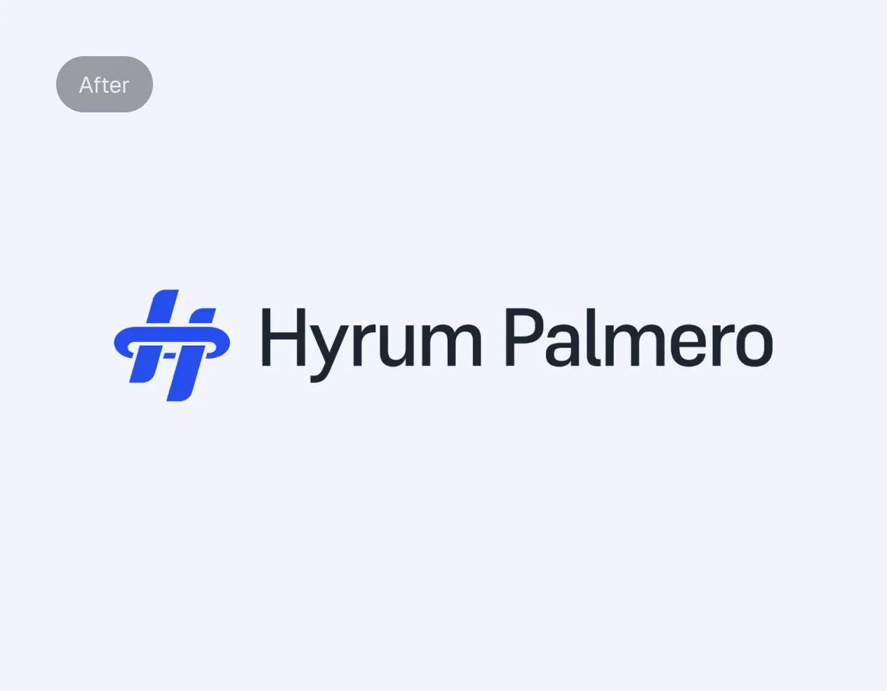
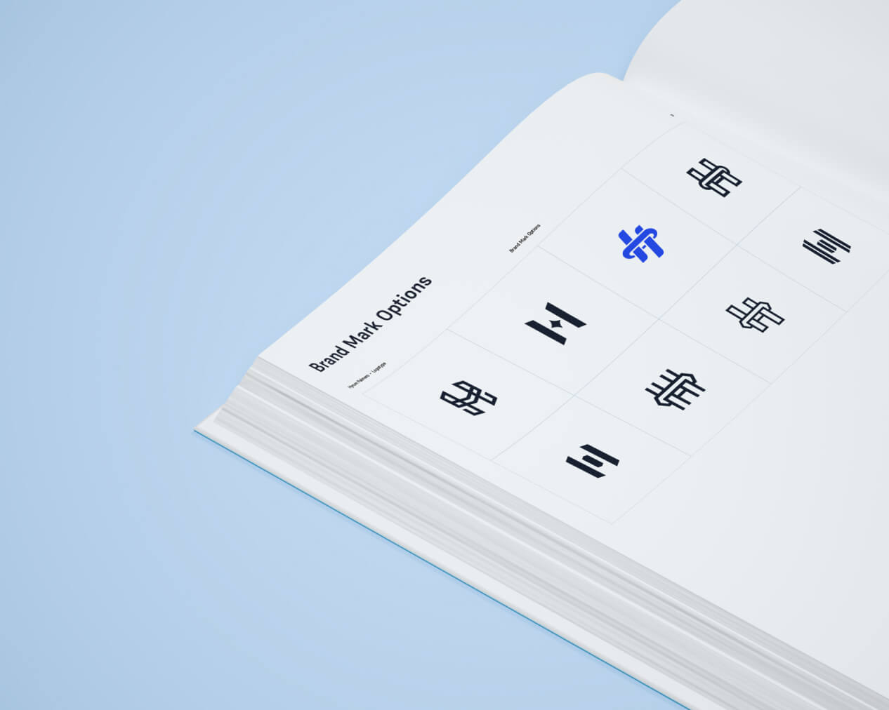
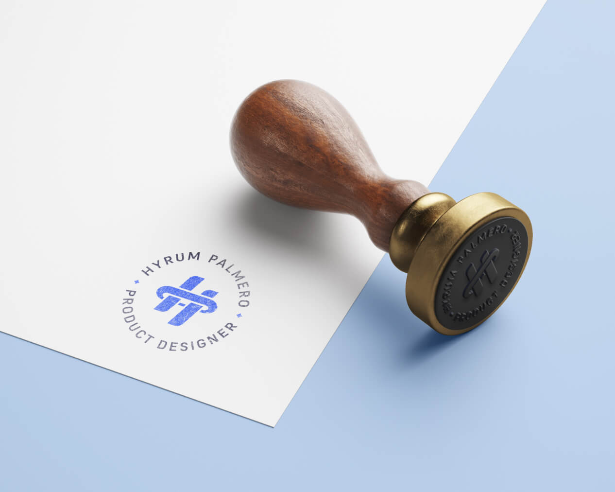
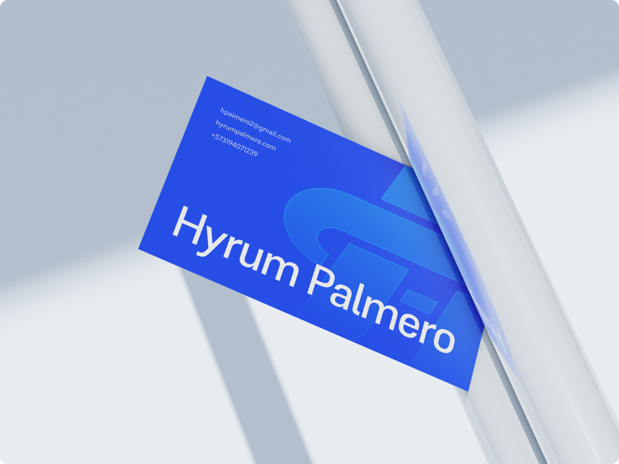
Hyrum wanted to keep a simple monogram but also to add more personality. After several iterations, we landed on a monogram concept, a combination of his initials: H + P. With this brand mark, we were ready to set him apart and create a distinctive symbol for his logo.

A Typeface That Grows With the Brand
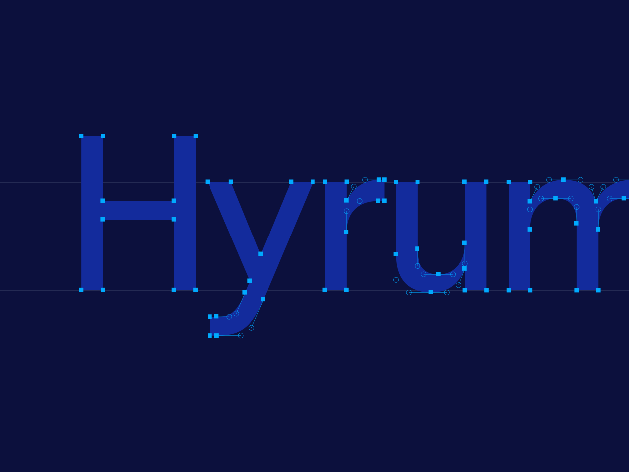
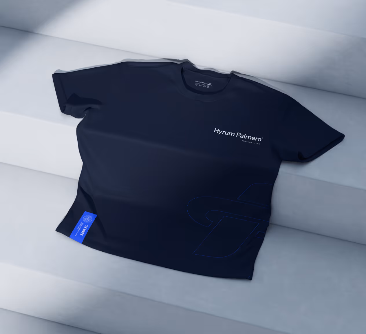
We needed a typeface that could solve three key problems: it had to be open-source and free for commercial use, feel modern and minimal, and work across a scalable design system. After exploring different options, we chose Supreme from Fontshare. It checked all the boxes: clean, versatile, and strong enough to carry the brand across digital and print with consistency.
Guidelines That Keep the Brand Sharp
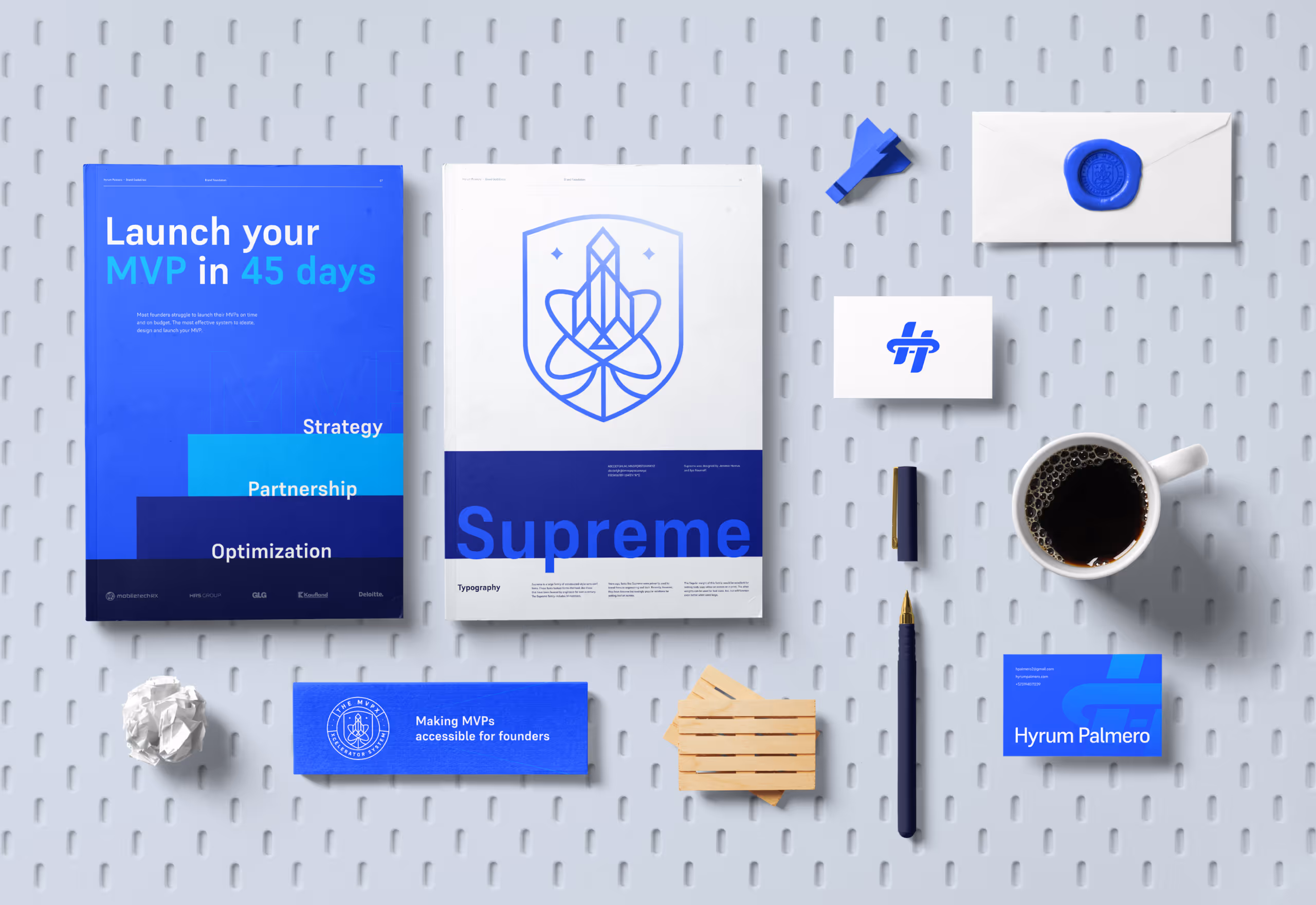
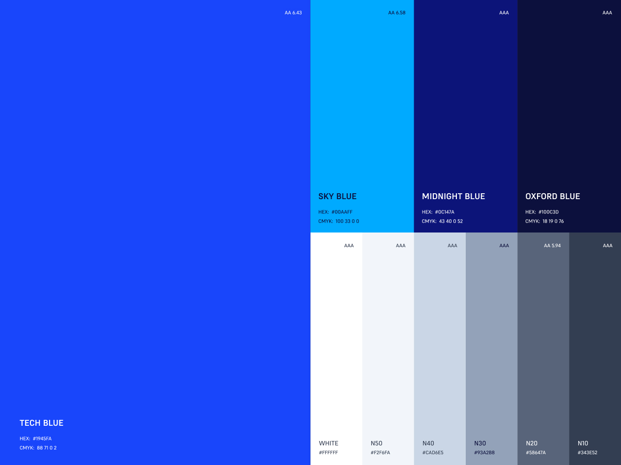
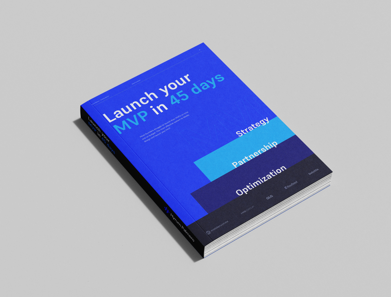
As part of the brand refresh, I designed a simple yet complete set of brand guidelines. The goal was to provide Hyrum with a clear system he can use across different platforms without second-guessing. From logo usage to color, typography, and layout rules, everything was designed to help him scale the brand consistently and maintain it with confidence.

The Results ↓
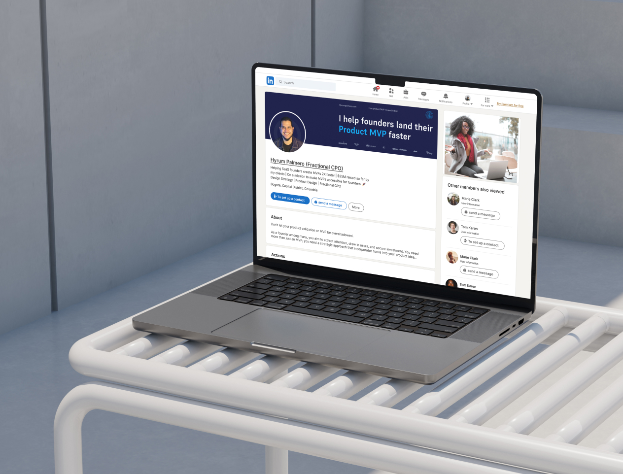
Hyrum’s new digital presence and content quality have transformed his lead generation system on LinkedIn. This new visual identity sets him apart and positions him as a high-level consultant in the startup landscape.